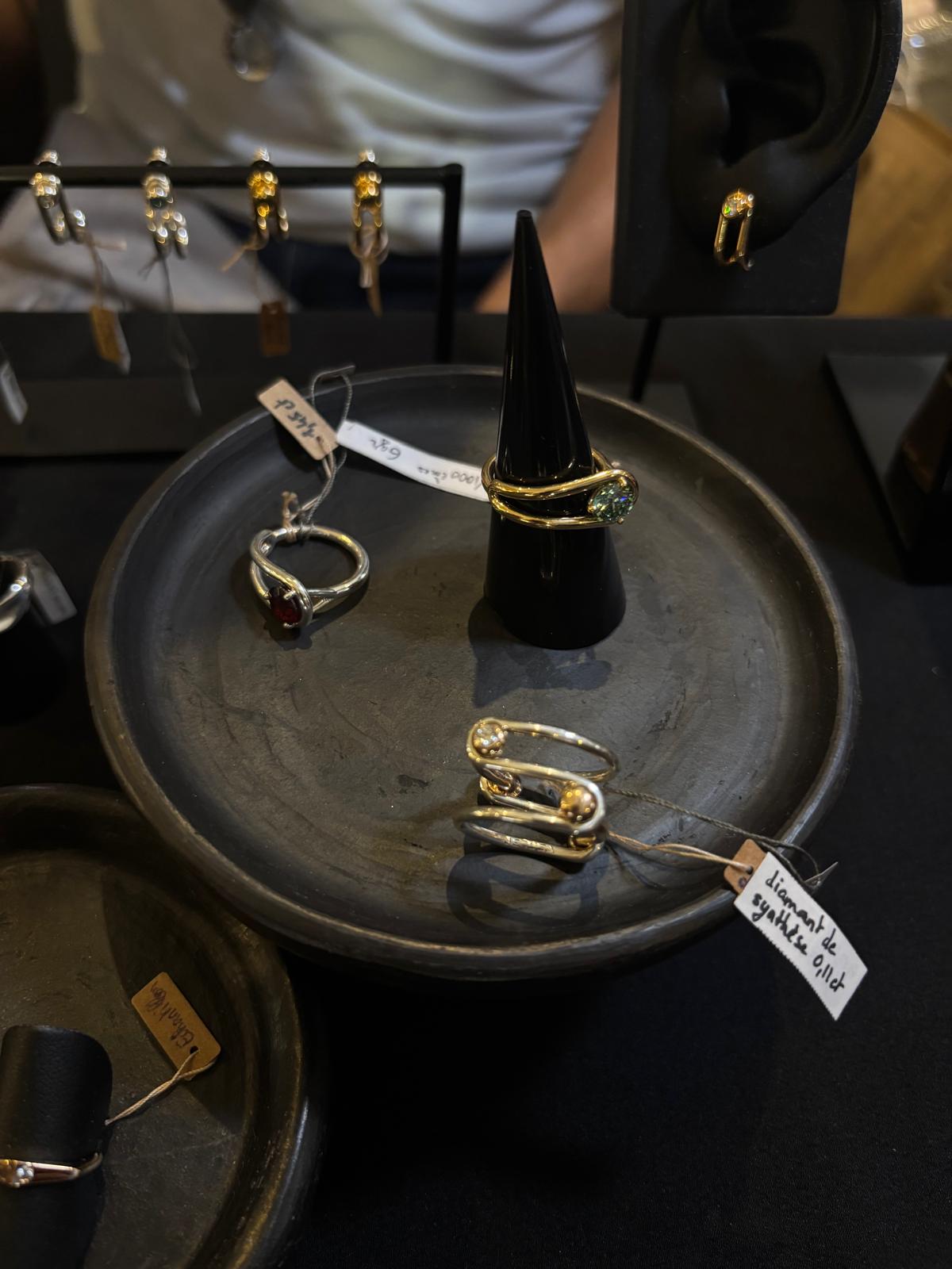
What makes a piece of jewellery memorable? Is it the stone, the craftsmanship, the silhouette, or something less tangible, an idea that stays with us long after we have looked away?
At NouvelleBox Paris, I found myself returning to this question. From 1 to 5 October, the showroom brought together more than twenty independent international jewellery designers for its Spring/Summer 2027 presentation, with a guest-curated selection by For Future Reference. Set on Rue de Richelieu, the gathering offered a glimpse into a world of fine jewellery less concerned with a singular definition of luxury than with the possibilities of individual expression.
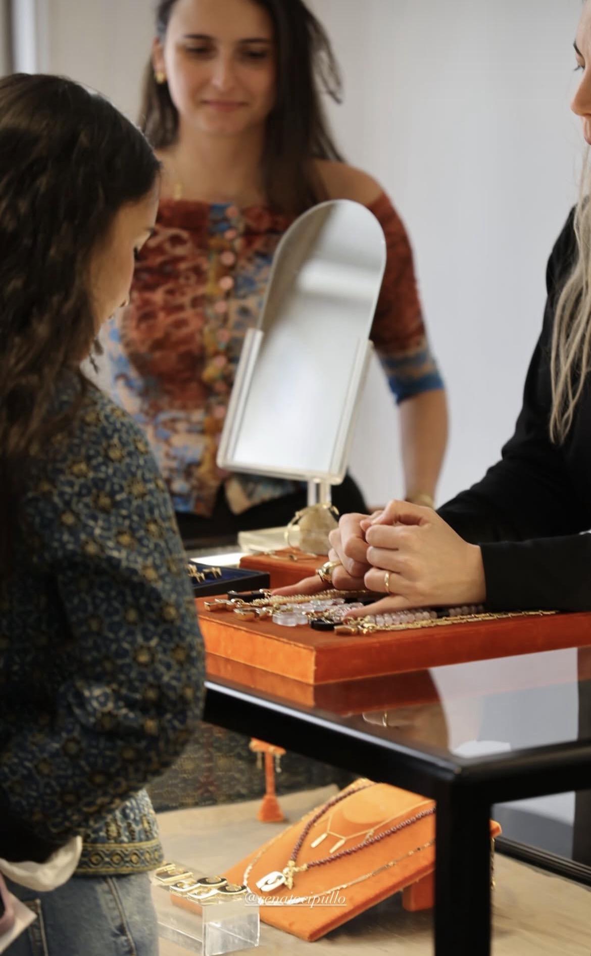
Sharing a moment with the Renato Cipullo team at the NouvelleBox
Moving between Loro, Renato Cipullo and Fern Freeman, and discovering the work of Lizzie Mandler, I was struck by the different starting points behind each designer's work. Movement, lettering, play and architecture became ways of thinking about jewellery beyond its material value. These were not simply objects to admire in a display case, but propositions about how we might wear, interpret and live with design.
Fern Freeman: The emotions in the unexpected
Fern Freeman was one of my most memorable discoveries of the showroom. I was particularly drawn to her moving rings, whose appeal lies in the relationship between form, movement and colour. They possess a quality that is unusual in fine jewellery: a sense of animation, as though the piece has not entirely finished revealing itself once it has been made.
The ring, after all, is one of jewellery's most familiar forms. Its circular silhouette has remained remarkably constant across centuries, its meaning shifting between adornment, commitment, status and personal identity. Freeman introduces another dimension by making movement part of the experience. The jewel is no longer simply something to look at; it invites interaction, changing subtly with the gestures of the wearer.
Colour adds another layer to this play. Rather than relying solely on the conventional language of preciousness, the designs draw attention to the visual relationships between their elements, allowing colour and geometry to contribute to their individuality.
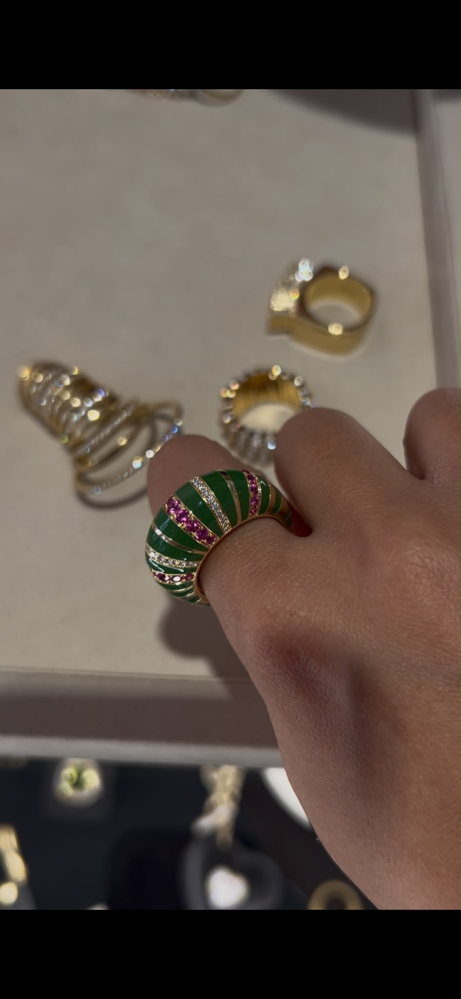
Cocktail ring with green enamelling
I was also intrigued by Freeman's willingness to explore unexpected materials, from wood to more unconventional inclusions. There is a certain confidence in questioning the hierarchy that separates the precious from the ordinary. A material does not necessarily need an established pedigree to become interesting; it needs to be used with intention.
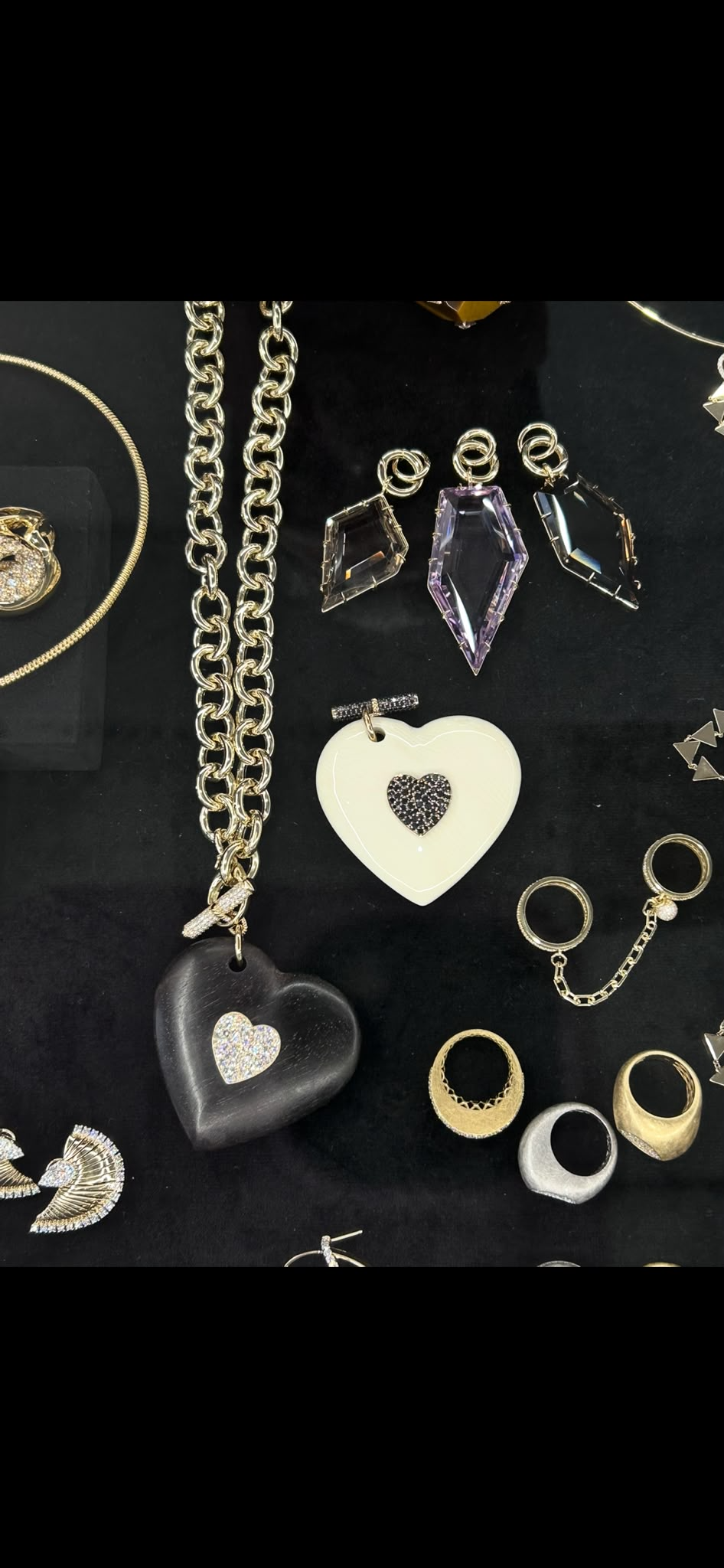
Pendants made with wood (left) and condensed milk (right)
What I appreciated most was that the experimentation felt connected to the object itself. Movement was not merely a novelty, nor was colour simply decorative. Both became part of what made the pieces distinctive. In a category where innovation can sometimes be reduced to an unusual stone or an elaborate setting, Freeman's work offered a more engaging question: what if the experience of wearing a jewel were itself part of its design? Renato Cipullo: The intimacy of a letter
At Renato Cipullo, my attention turned to lettering and the stories that can be held within a familiar symbol.
Initials and monograms have occupied a place in jewellery for generations. They are among the most direct ways of making an object personal, connecting it to a name, a relationship or a particular moment in one's life. Yet their familiarity is precisely what makes them interesting as a design proposition. How can something so recognisable continue to feel individual?
Cipullo's play with letters invites us to consider the alphabet as a visual language as much as a means of identification. A letter has its own proportions, curves and graphic character; translated into jewellery, these qualities become tangible. The choice of form can transform a simple initial into an object with a distinct personality.
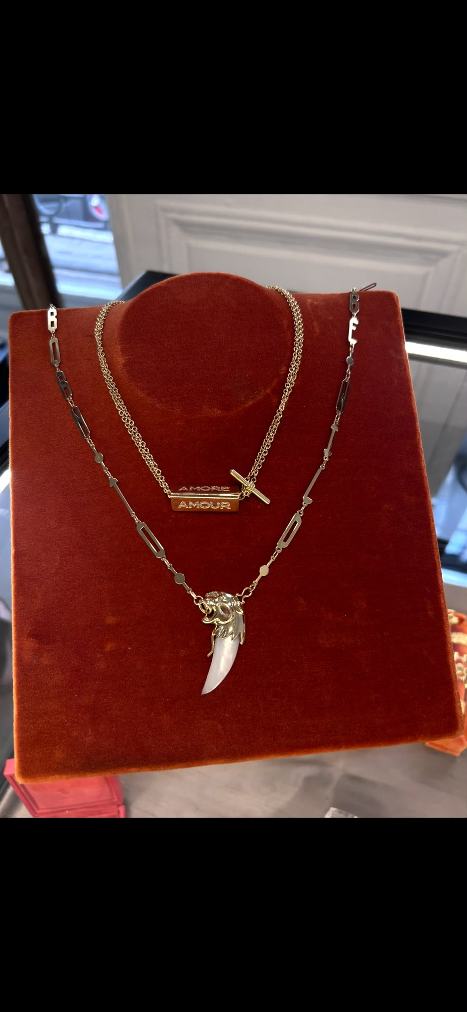
I have always found this relationship between jewellery and identity compelling. A piece can be immediately legible to everyone who sees it, while its significance remains entirely private to the person who wears it. The letter may be visible, but the story behind it does not have to be explained.
There is also something enduring about this form of adornment. Trends in silhouette and gemstone colour will inevitably shift, but a personal symbol can acquire new meaning as the wearer's life evolves. What begins as an initial can become a keepsake, a marker of belonging or an object eventually passed on to someone else.
At Cipullo, I was reminded that storytelling in jewellery does not always require elaborate symbolism. Sometimes, the smallest gesture is enough.
Loro: In praise of play
There is a certain freedom in the way children approach objects. They experiment without worrying too much about convention; they follow curiosity rather than a predetermined outcome. At Loro, I was drawn to this sense of childlike play and the possibility of bringing that instinct into fine jewellery.
Luxury can be a remarkably serious business. Its language is built around rarity, permanence, precision and the cultural significance of precious materials. Playfulness offers a counterpoint, introducing a sense of spontaneity without necessarily sacrificing sophistication.
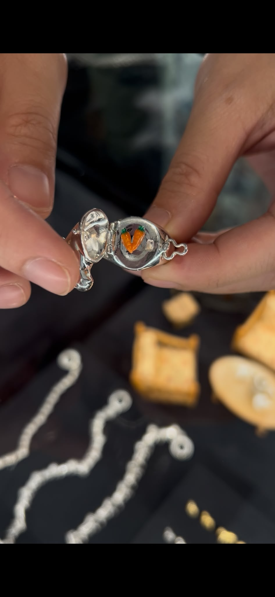
Objects inspired by children’s toys as seen at Loro
What interests me about this approach is the distinction between a playful design and a frivolous one. The former can be the result of considerable thought: a careful negotiation of shape, proportion and balance that allows the finished piece to appear effortless. The challenge is to create something that feels instinctive while remaining resolved as an object.
Loro's spirit of play reminded me that jewellery does not always need to communicate its significance immediately. It can be curious, expressive and even a little mischievous. It can appeal to the adult who appreciates craftsmanship while retaining the child's desire to explore an object simply because it brings pleasure.
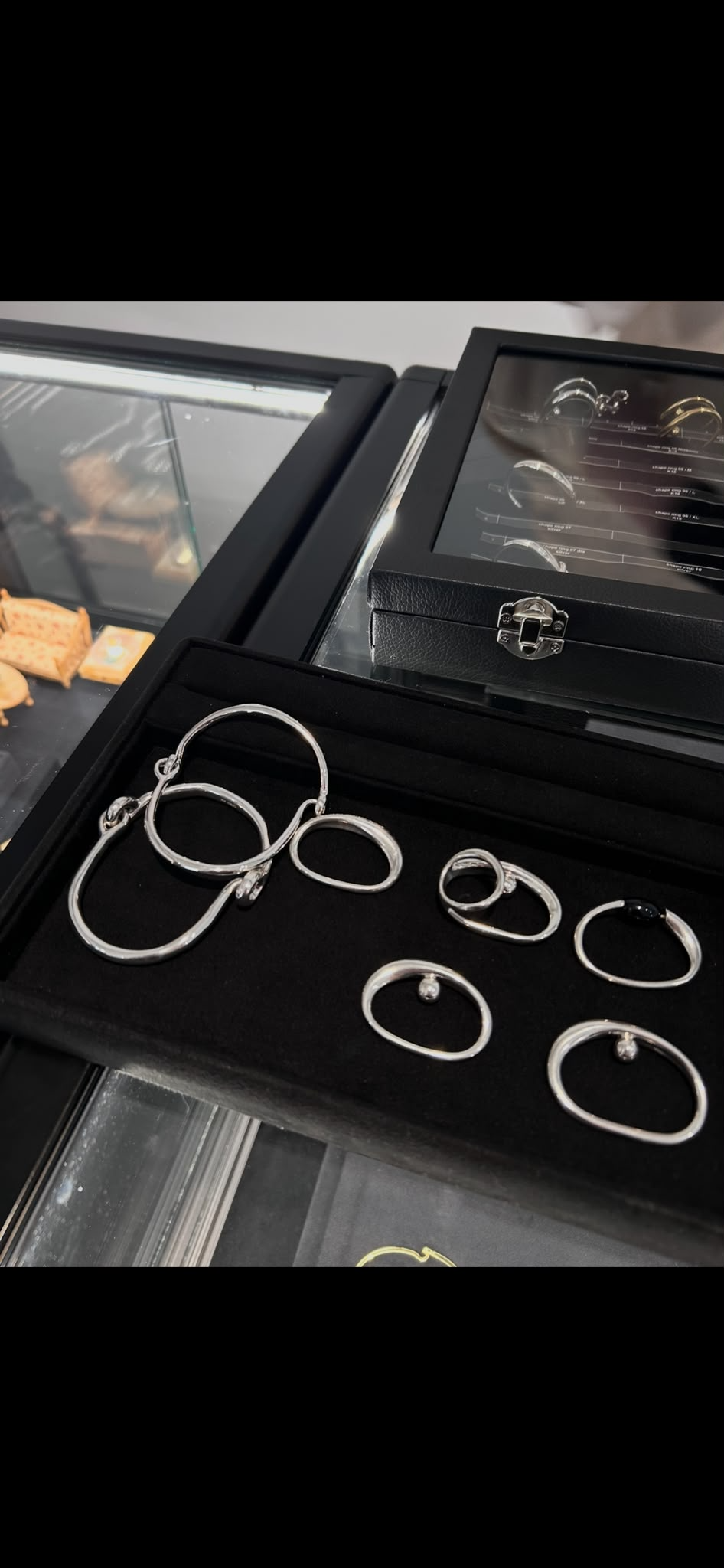
Rings and bracelets at Loro
Perhaps this is an underappreciated quality in luxury: the ability to take design seriously without taking oneself too seriously.
Lizzie Mandler: The architecture of adornment
Lizzie Mandler's work offered a different kind of fascination, grounded in the relationship between architectural form and gemstone setting.
In fine jewellery, the stone often takes centre stage. Its cut, colour and brilliance naturally command attention, while the metal surrounding it is discussed in terms of craftsmanship and technical execution. But a setting can do much more than hold a gemstone in place. It can change how we perceive the stone, introduce direction to a composition and determine the relationship between the jewel and the body.
What I found particularly interesting about Mandler's designs was the architectural quality of their forms. Clean lines and considered geometry give the pieces a sense of structure, while distinctive settings allow the metal to become an expressive element in its own right.
The relationship between architecture and jewellery is worth considering. Both disciplines depend on proportion, material and the careful negotiation of space. A building is shaped as much by its openings and negative spaces as by its walls; similarly, a jewel's character can emerge from the space around a gemstone as much as from the stone itself.
This is especially evident when a setting challenges the expected relationship between metal and gem. Instead of disappearing into the background, the structure becomes part of the visual statement. The stone and its setting enter into a dialogue, each informing the way the other is seen.
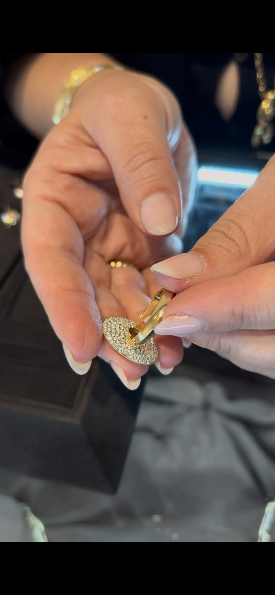
Hidden pave setting seen in Lizzie Mandler’s designs
For me, this is where technical precision becomes genuinely creative. The setting is no longer simply a solution to an engineering problem; it becomes part of the designer's vocabulary, giving a piece its own identity without overwhelming the natural qualities of the gemstone.
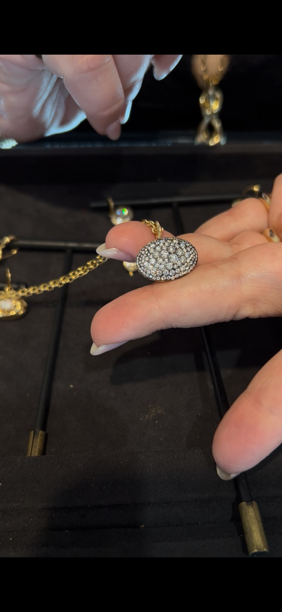
Redefined pave setting to capture light at Lizzie Mandler
Moving between the different designers, I found myself thinking about what independent jewellery can offer an industry with such deeply established codes.
Its appeal is not simply that it provides an alternative to the great maisons. Nor is independence, in itself, a guarantee of originality. The more interesting possibility lies in the freedom to begin somewhere unexpected: with movement rather than a stone, a letter rather than a gemstone, an instinct for play rather than an established aesthetic, or an architectural idea that changes the way a setting is conceived. I left NouvelleBox thinking about the difference between a jewel that catches the eye and one that holds our attention.
The first may impress us through its brilliance or its silhouette. The second gives us something to return to: a detail that reveals itself gradually, a construction that changes our perception of a familiar form, or an idea that acquires a more personal meaning the longer we spend with it.
Jewellery occupies an unusual place in the world of design. It can be a work of extraordinary technical skill, an expression of identity and an intimate companion in everyday life. It is made to be seen, but it is also made to be worn, touched and lived with. Its significance often emerges not in the moment of purchase, but through the relationship that develops between the object and its owner. And perhaps this is what I find most compelling about the discipline. A jewel can be small in scale yet expansive in possibility. It can hold a memory, express a personality or challenge a convention without needing to announce its intentions. Sometimes, all it asks of us is to look a little longer.